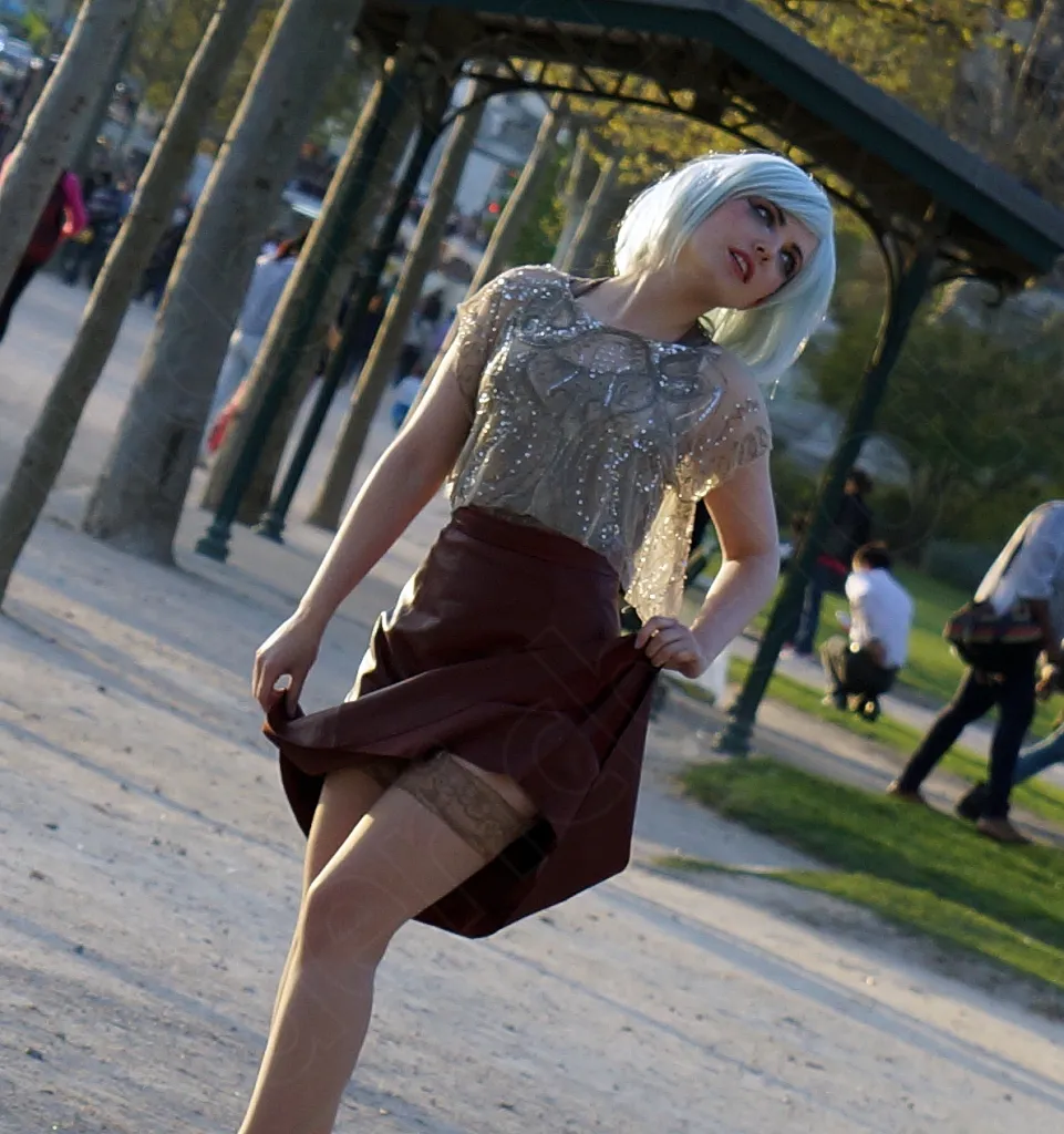
Getting Photo Composition Right
Composition is what’s left when you take away the subject, the light and the luck: the way the elements are organised within the frame. You can have a magnificent subject and perfect light and still miss the shot, simply because nothing inside the frame guides the eye. Conversely, solid composition often rescues an otherwise unremarkable scene.
The rule of thirds, and why to break it sometimes
Mentally divide the image into three horizontal and three vertical bands, then place the main subject on one of those lines or at their intersection: that’s the foundation, and it works in the vast majority of cases because it counters the natural reflex to centre everything, which freezes an image and makes it static.
But the rule of thirds isn’t a law. A perfectly centred subject can be a strong choice — for a frontal portrait, an architectural symmetry, or simply to create tension with what the eye expects. The question to ask is never “am I following the rule?” but “does this placement serve what I’m trying to say?”
Lines that lead somewhere
A street plunging into the image, a railing, the edge of a building, even a cast shadow: any line in the frame draws the eye and can be used to lead it towards the subject rather than letting it wander across the whole surface of the image. Before pressing the shutter, I almost always look for a natural line in the scene I can put to work rather than merely put up with.
Leave room — empty space isn’t a flaw
A completely filled frame tires the eye. Leaving emptiness around the subject — a stretch of sky, a plain wall, space in the direction of the gaze or the movement — gives the photo room to breathe, and paradoxically strengthens the subject rather than diluting it. This is especially true in street photography: resisting the urge to “fill the frame” is often what separates a photo that breathes from one that suffocates.
Depth, or how to give thickness to a flat image
A photo has only two dimensions, but you can suggest the third: a sharp element in the foreground, the subject at mid-distance, a background fading slightly away — this layering of planes creates a sense of depth sorely missing from images where everything sits on the same plane. A silhouette edging into the bottom of the frame, a half-open door, a branch reaching in: so many small elements which, used well, turn a flat photo into one with real volume.
In the end, composition isn’t learned in one go: it’s a muscle built by looking at lots of photographs, systematically asking yourself why one image works and another doesn’t, and above all by taking the time, before pressing the shutter, to really look at everything in the frame — not just the subject.